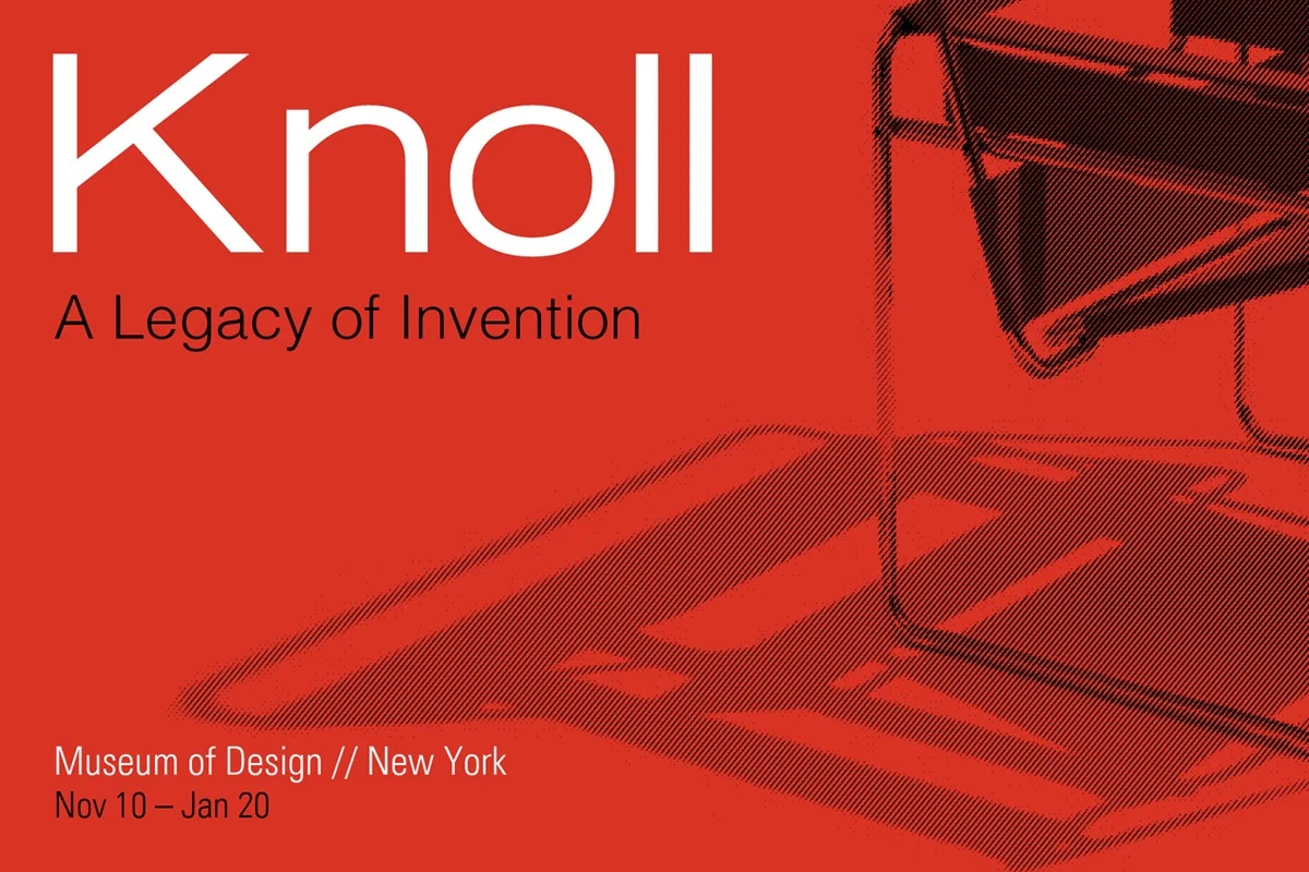


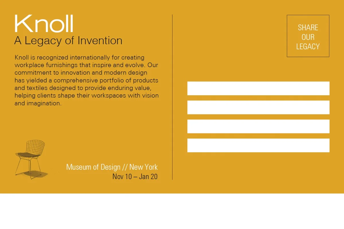


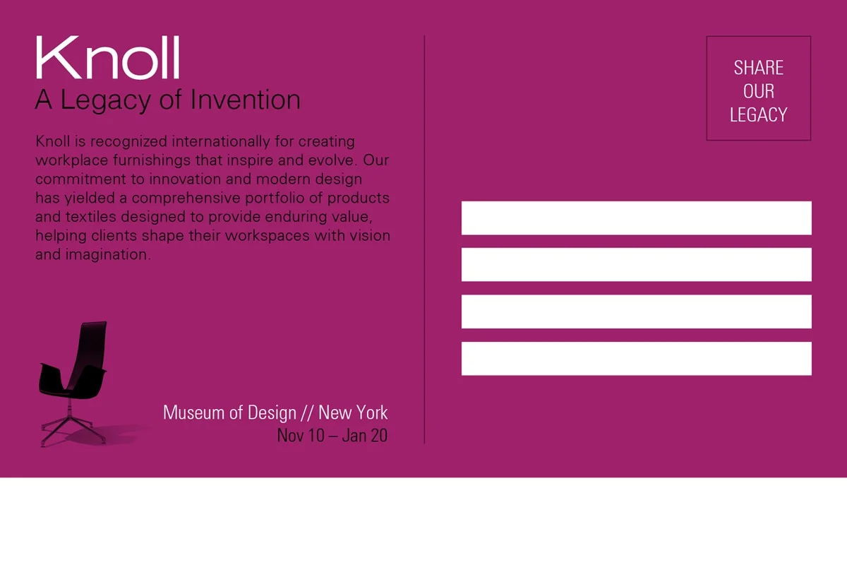
The final set of four postcards that I designed to advertise an upcoming furniture exhibit at the Museum of Design. I worked on the furniture brand “Knoll”, which is well known for their sustainable, modern design in the workplace. The four postcards are designed to be mailed out in succession, each week leading up to the exhibition.
My concept was loosely based off of a silk-screen approach; the images I selected had striking shadows in their original state and I wanted to highlight that detail to incite an interest in the show, giving viewers just a suggestion of what they would see (and in turn, garnering interest to see more) when visiting the exhibition. The bold color choices are reflective of Knoll’s signature brand colors and the simplistic type design is built off of an aligned grid, using hierarchy to field through the information.
The back of the cards were as carefully considered as the front, ensuring that details were all accounted for including the white space where the Post Office prints their barcode, all providing a cohesive and fully functional design in line with Knoll’s aesthetic. As you may (or may not) have seen, I started with 3 directions to choose from. Narrowing it down, this was the final result of some tight grid-work, reconsidering several issues and coming up with design solutions that made the postcard actually “work”. It is awesome to look back and see how I have developed this project; I hope you enjoy the final result. Feedback and/or criticism as always is welcomed and encouraged!

Branding + Identity Design
Branding + Identity Design