


Brightwire set out to redefine how educational support for children with dyslexia could feel — moving from clinical and stigmatized toward confident, approachable, and empowering. The visual system was crafted to build trust with families while creating a flexible foundation for curriculum, communications, and future program expansion.
Students needed to see themselves in the brand. To do this, we unified the Bright lines found around a light bulb with the "twisted wire” inspired letter “W”, creating a one of a kind icon that represents an encouraged student.
Our symbol is the foundation of our community mark, bringing the learner, their guides and friends to the forefront as a supportive collective excited about learning, sharing and building confidence while engaging with each-other.
This community approach applied in a pattern creates an engaging, illuminated, kaleidescope-like appeal that represents the endless possibilities, encouragement and trust that the Brightwire journey offers everyone involved.
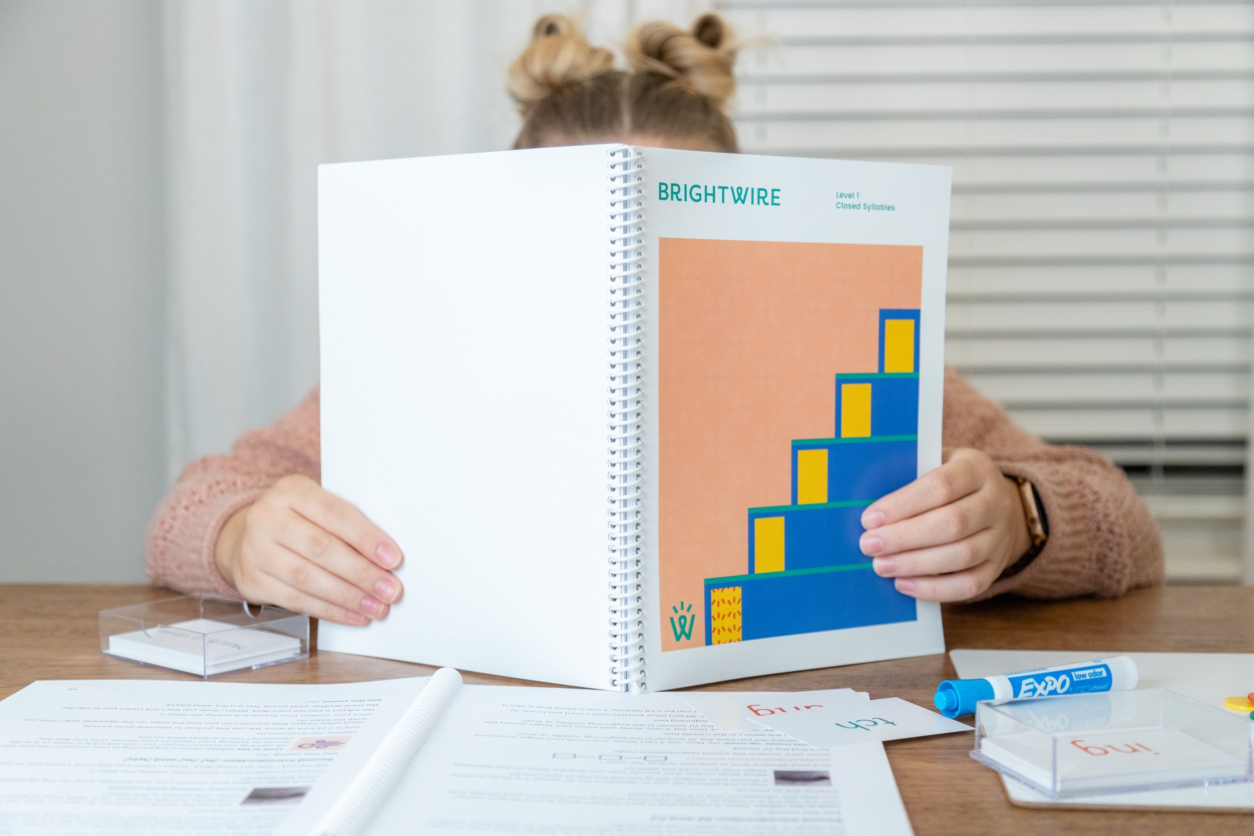
Custom patterns were created to add engagement and recognition across program manuals and workbooks, showing the “student” icon advancing in each level of the program.
Bold, fun colors and a blocky, curvy secondary typeface add visual interest and hierarchy across social media and other communications to create a warm, friendly and energetic appeal.
An extensive set of guidelines were developed to define how the brand’s messaging and appearance should be used consistently, intentionally and strategically across all forms of branded communications.