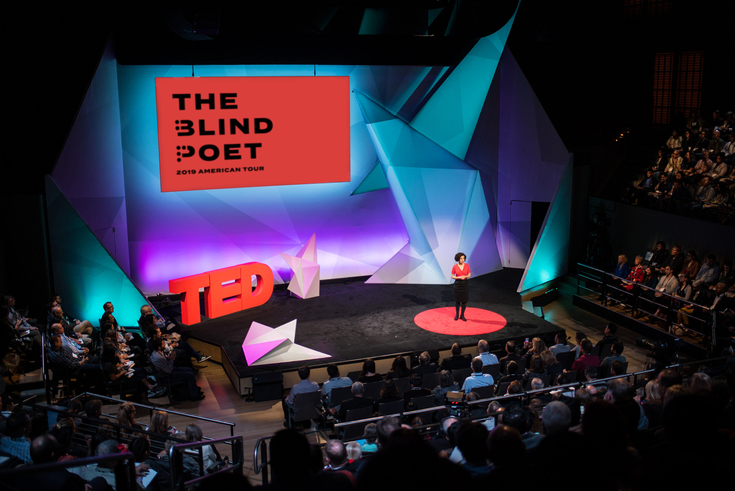
The Blind Poet
An award-winning poet and advocate for the blind needs a logo that embodies his mission to create an inclusive, supportive community while diminishing misconceptions associated with blindness.
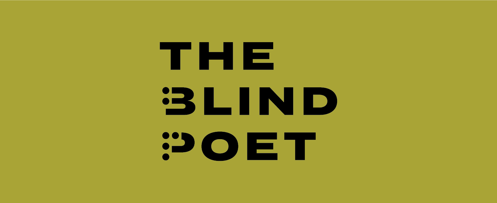
The logo’s approach is rooted in unity, regardless of people’s ability; building access for all into our every day lives instead of shying away from our differences.
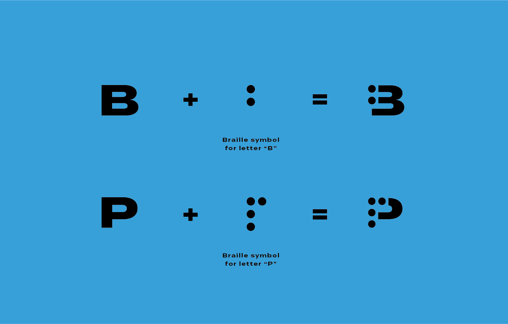
Braille is a form of written language for blind people, in which characters are represented by patterns of raised dots that are felt with the fingertips.
Incorporating braille with traditional letterforms celebrates that people of different abilities can all coexist seamlessly - even in unexpected ways, inspired by accessible design.
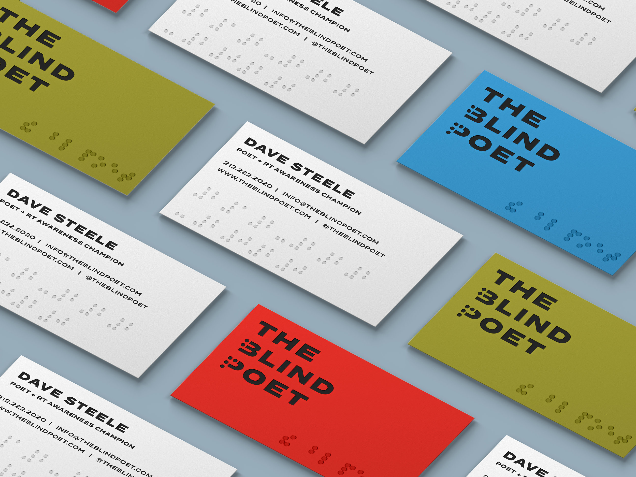
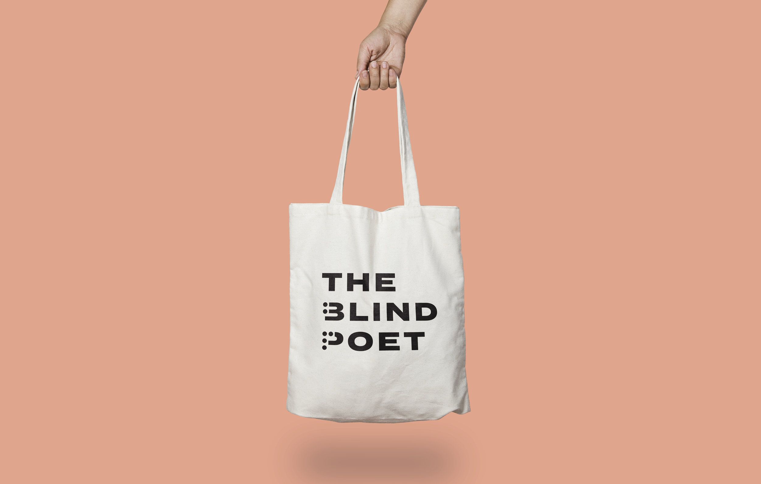
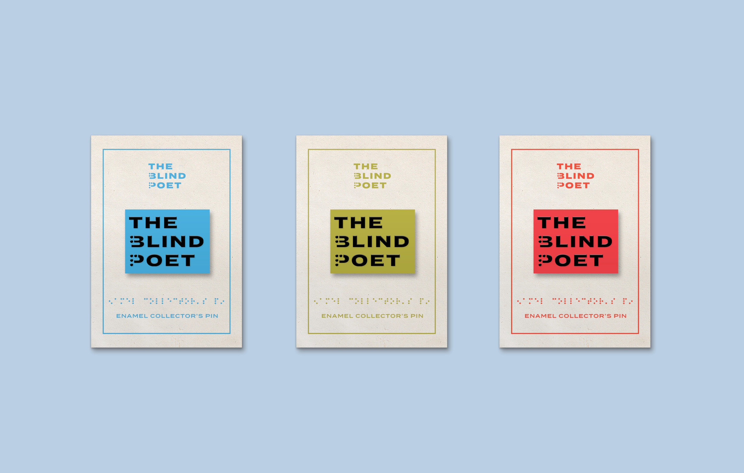
Merchandise to support The Blind Poet’s upcoming American tour was created, using red, green and blue - the colors that correspond to the color-sensitive cones in the retina of the human eye.
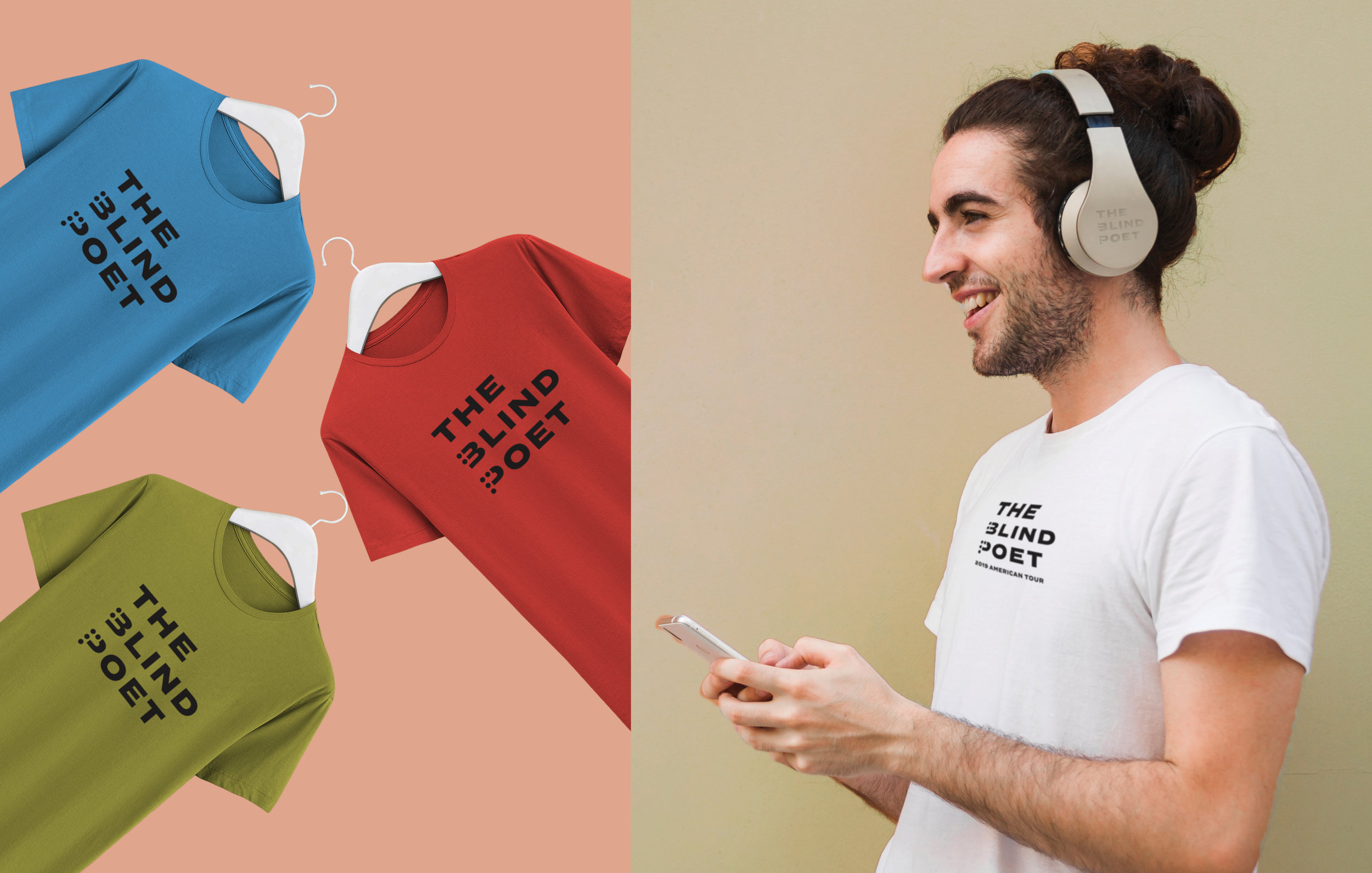
This intentional color inspiration is another built-in approach influenced by accessible design - allowing people of all sight abilities to appreciate different applications of the identity - from collector’s pins to large scale event graphics.
